| Before 1978 |
| It's hard to believe now, but school textbooks used to be laid out like a novel. That is, the text was just streamed on from page to page with no thought for layout except for a new chapter starting on a new page. A well-known textbook of the day started a new topic on 'Energy' (a major topic in Physics if ever there was one) just 3 lines before the bottom of a right-hand page! Diagrams and photos (in black & white) were fairly sparse and normally not placed next to the relevant text. They were referenced by items like "See Fig 12.13", so that by the time the student had found the correct illustration they'd probably lost track of the relevant text. Sentences were long, sometimes over 50 words, and reading age formulas could give 'impossible' numerical values of over 40 years for the reading age! Students were challenged linguistically before they could get past the text to the science. Physics as a subject was presented in a dry 'academic' way, with little relevance to a student's life. |
| The Cover | 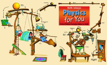 |
| When Physics for You was published in 1978 it caused shock waves, initially because of the cover. No previous school book in the UK had used a cartoon for the cover, and now there was a large cartoon covering both front and back of a physics book. It illustrates many physical principles as well as including the book's cartoon character of Professor Messer. |
|
| Reviewers had mixed views at first, but soon approved [1], [2]. It has been described as "the best physics book cover ever" [3] and it is downloaded thousands of times each year as a screen-saver [4]. |
| Cartoons | 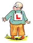 |
|
| Cartoons were also used inside the book, mainly involving the bungling 'hero', Professor Messer: | ||
| Perhaps that is why the book was initially rejected by so many publishers in the two years before Bob Osborne of Hutchinson Education saw the potential and was brave enough to take it on. Other publishers sent rejection slips with comments like "humour is inappropriate in a school textbook". But the cartoons (and limericks, see below) have had a significant impact on readers [5]. |
| Double-page Spreads | 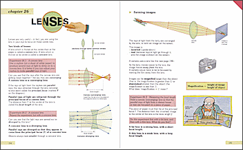 |
Keith insisted that every double-page spread was designed by him as an entity, with no sentences split between pages. |
| Layout of paragraphs |
| Within each page, the paragraphs were carefully laid out with effective use of horizontal white-space between paragraphs. If the next paragraph is an immediate and obvious consequence of the previous paragraph then the gap is small, perhaps only 3pt, 6pt or 9pt. If the next paragraph is a bigger conceptual leap, then the white-space between the paragraphs is larger, much as a teacher in class would make a longer pause before starting a new development or concept. |
| Sculpted text | ||
| Previously, textbooks had almost always used fully-justified text so that the right-hand 'coastline' of the text was a strict vertical line. This makes it more likely that a less-competent reader will lose their place and perhaps jump a line with consequent loss of comprehension. | ||
| Keith insisted on: | ||
| Un-justified text, to give an irregular right-hand coastline, to help readers. | ||
| No hyphens were ever allowed to break long words at the end of a line. | ||
| Hyphens were sometimes inserted deliberately at the first mention of a complex word, to help the reader. For example: electro-magnetism, photo-synthesis. |
||
| Wherever possible, sentences were of the form: Subject -> verb -> object. For example: 'The cat sat on the mat', and not: 'On the mat sat the cat' or 'On the mat the cat sat', etc. |
||
| Generally, shorter 'Saxon' words like 'got' and 'put' were used in preference to longer 'Norman' words like 'obtained' and 'placed'. | ||
| An active writing style was used, with frequent questions to the reader, to avoid a dull passive 'voice'. Pages include a large number of '?' marks, aiming to demand attention from the reader. Often these questions are on knowledge that the reader may not yet have ...but the answers can be found or deduced from an illustration or statement somewhere on the same spread ...so the reader has to actively search for the answers. |
||
| In addition: |  |
|
| He fine-tuned the text ('sculpted' it) by adding / deleting / selecting words in such a way as to make the end of a line an 'invisible comma', where a reader might naturally pause to assimilate the content, before their eyes jump back to start the next line. | ||
| An example (from the first page of Physics for You) | ||
| A first draft might read as shown here: where the vertical lines indicate the available space for the text block (because of artwork etc). The line-breaks are clumsy, even if the hyphenation were removed. |
||
| A slight change to the wording provides a better result, as shown: where the ending of the lines now form 'invisible commas' with natural pauses to allow the reader's brain to assimilate each successive idea or concept. Each of the 7 lines is now a complete thought. For a single paragraph this effect may not be significant, but used throughout a book it has a beneficial effect for the reader. |
 |
|
| Personal pronouns |
| Throughout the book Keith Johnson used personal pronouns where possible (you, your, we, our, etc). (This was thought to be unacceptable in earlier science books.) Using 'The cat sat on your mat' rather than 'The cat sat on the mat' draws a more personal response from the reader, to engage them in the text. |
| In research in 1997 into the Human Interest Scores of a range of UK science textbooks, Keith found large disparities in the way that the textbooks used personal words [8]. Physics for You out-classed every other Physics book [9]. |
| Typeface, fonts, letter-spacing | |
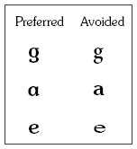
| Before publishing Physics for You, some research was done on fonts. It is well known that serif fonts are generally more legible that non-serif fonts, but in addition care was taken to avoid the "spectacles" 'g' that was often used in earlier books, in favour of the kind of 'g' that is more like a pupil would write. Similarly with the closed lower-case letter 'a' rather than an open 'a'. And a lower-case letter 'e' that is open and more legible. The current edition of Physics for You uses a Souvenir typeface, but with the 'a' changed to be a closed 'a'. This typeface has 2 levels of boldness, which are used to emphasise key ideas and key words or definitions. |
 |
| A double-space is used after every full-stop (period) so it is more clear that a new sentence is beginning. | |
| And a thin space is inserted before each '?' question-mark to help make clear that it is a question, with the intention of keeping the reader more alert, with an interactive text. | |
| Reading Age |
| There are many aspects to Readability, some researched by Keith Johnson [10], [8]. Some of these aspects have been discussed above, but one of the most crucial is the Reading Age of the text. For a pupil to read independently (without help, but with comprehension) the Reading Age of the text should be 2 years below the pupil's Reading Age. The Reading Age of text can be determined in several ways [11]. |
| Research done in 1978 by Keith Johnson [12] showed that many Physics books at the time were well off the scale, and only Physics for You had a reading age of 13 years or less. A few years later in 1986, follow-up research by Chris and Keith Johnson [13] showed that the average reading age of UK physics texts had dropped by a year, perhaps because of increased awareness and the example and success of Physics for You. In 1998 the '4F' method of determining reading ages [8] showed that Physics for You still had the lowest reading age (at 12 years) of any UK Physics textbook. |
| 'Figure 12.13' | |
| Earlier textbooks placed diagrams anywhere and referred the reader to them via "See Fig 12.13" etc. This was unhelpful in 2 ways: |
|
| • | the reader has to break off reading to search for the relevant diagram, possibly losing their way, |
| • | the numbering was confusingly non-decimal, with Fig 12.9 being followed by Fig 12.10, etc. |
| In Physics for You all illustrations were carefully designed-in, so that they are adjacent to the relevant text. | |
| Illustrations | ||
| In writing a science book there is often a battle between the artistry that the illustrator may wish to introduce and the scientific accuracy that the author requires. Some of the principles that were used in Physics for You were: | ||
| Careful judgement as to whether a 2D or 3D illustration was more appropriate. 2D artwork is easier for a pupil to copy (if that is necessary); 3D artwork may give the reader a better appreciation of the apparatus and its scale. | ||
| Several iterations of artwork editing and proofing to ensure scientific accuracy despite some illustrators adding 'artistic' touches. | ||
| Label-lines never horizontal or vertical or at an angle where the reader might perceive the label-line to be part of the diagram itself. The label-line to end in a dot on the part of the diagram being labelled. | ||
| Standard colours for some items. eg. all magnets were a standard 'pantone' pale purple for easy recognition. |  |
|
| In addition to these illustrations in the text, each of the 38 chapter headings had a themed chapter title to set the scene: | ||
| People / faces / hands | |
| To enhance the reader's personal response to science, as well as personal pronouns in the text (see above), the illustrations included where possible: | |
| People, or at least hands, rather than disembodied apparatus shown in earlier textbooks, with | |
| hands or faces of suntanned colour, not white/pink, to be more acceptable to different ethnic groups, and | |
| for situations involving people, hand-drawn artwork with texture, not the crude bland computer-drawn artwork seen so often now. | |
| Research by Keith Johnson [8] [9] showed that many textbooks did not pay much (or any) attention to this personal aspect of a reader's interaction with a text. | |
| Formulas |
| All formulas were placed prominently in red boxes, with the units clearly shown next to each quantity, in the style now often used by examination boards. |
| Physics 'at work' |
| Another novel feature of Physics for You was the inclusion of many examples of Physics at work in the real world. By showing the usefulness of Physics it helps to make the pupil's learning more purposeful. |
| Sections on the History of science, on famous physicists, and a time-line of Inventions provided a historic context for the reader. |
| A section on possible Careers helps to make the study of Physics more purposeful. |
| Revision Aids |
| Physics for You was the first textbook to include sections on Revision Technique [14] [15] and Examination Technique [16]. |
| Other learning aids include sections on 'Doing your Coursework', 'Key Skills', and 'Check your Maths'. Pages with more difficult topics are marked with a red corner, so they can be omitted for a first reading. |
| Limericks, jokes, rhymes | A railway mechanic was sent To lay down some track across Kent, He forgot to design Some gaps in the line, And when it got hot, it went bent. |
| Another novel feature of Physics for You was the inclusion of jokes, limericks and other rhymes. The jokes are 'corny' but have a humorous relevance to the topic, as do the limericks [17] : |
![[1]](4U-Reviews/1978-PhysEducation-Vol13p327.gif)
![[2]](4U-Reviews/1979-PhysEducation-Vol14.gif)
![[3]](4U-Reviews/1997-TES-21March.gif)
![[6]](http://www.timetabler.com/physics4u/4U-Reviews/1978-SSR-Vol60p192.gif)
![[7]](http://www.timetabler.com/physics4u/4U-Reviews/1979-SSR-Vol61p188.gif)